Here is a brief overview of how light and colour work, in the context of LED lighting.
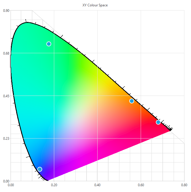
We’ll mostly be discussing the CIE 1931 colour space, with reference to the chromaticity diagram, shown below.
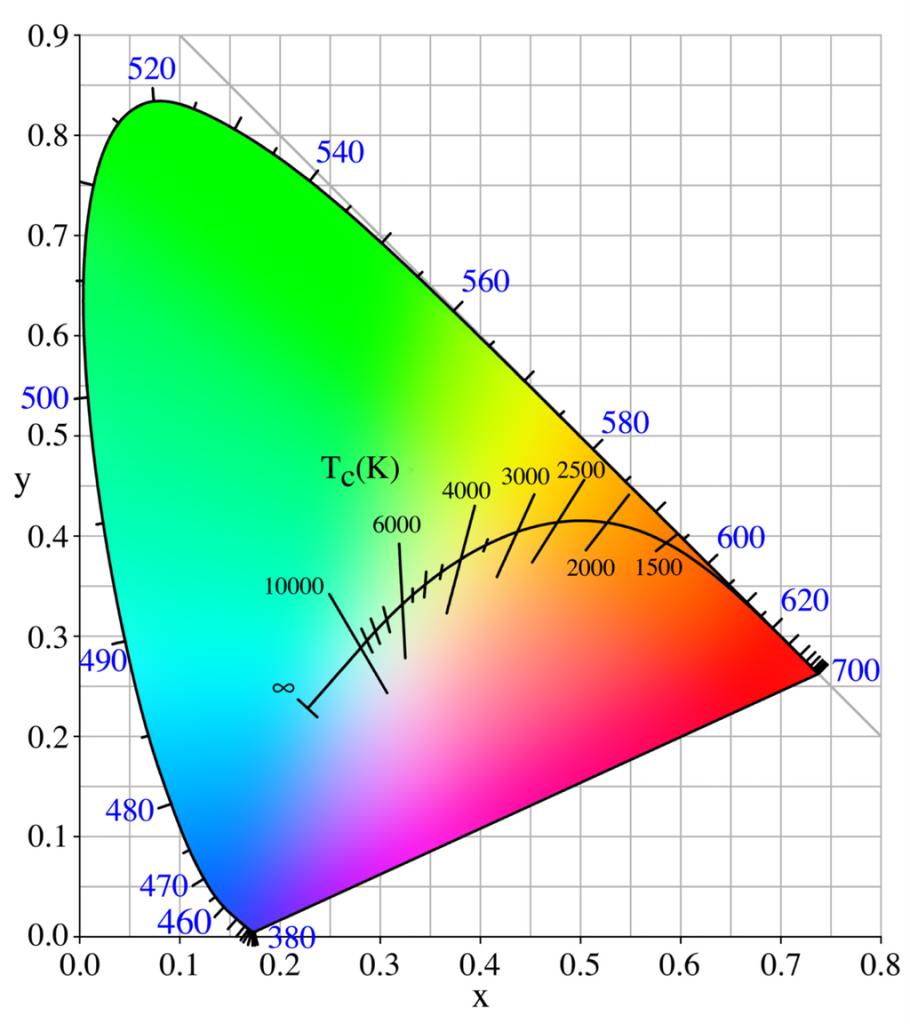
This is the 1931 version. Newer versions that look slightly different have come out, but the general intent is the same, and they are all used for different calculations. The 1931 version is “good enough” and is universally the one that is referred to when a colour is described in xy coordinates.
The points along the edge are pure visible wavelengths (displayed in nanometres). Anything inside the diagram is some mixture of the wavelengths.
Computer monitors don’t have the same kind of visible range as your eyes, so the colour space diagram above is just a representation, not the actual colours that you would be able to see if it were displayed side-by-side with the actual light wavelength.
There’s a curve along the centre, called the black body curve, that represents “white” light. White can be many different things – Typical incandescent bulbs are around 2500K, towards the right (warm) side of the black body curve. Daylight is very cold, with lots of blue components, towards the left. As long as it’s along that curve, it can be considered “white”. The vertical-ish lines indicate where that particular temperature extends, if a given data point isn’t exactly on the line. Duv, or “delta u,v” is a measurement describing the point’s distance from the line.
In terms of white LEDs, there will typically be a “warm white”, also called “tungsten”, and a “cool white”, called “daylight”. As shown by the black body curve, if you have both LEDs, you can’t interpolate between the two of them and expect the light output to follow the curve. It will be a direct line between the two. There are a couple solutions to this, and an easy cheat is to explore the strategy that one of the industry leaders is utilising.
The Philips Hue tunable white smartbulbs are excellent. I’ve taken apart a handful of smartbulbs, and the Hue has the largest quantity of LEDs I’ve seen(read: brightest), as well as using a few tricks to get better light quality than any other system I’ve seen.
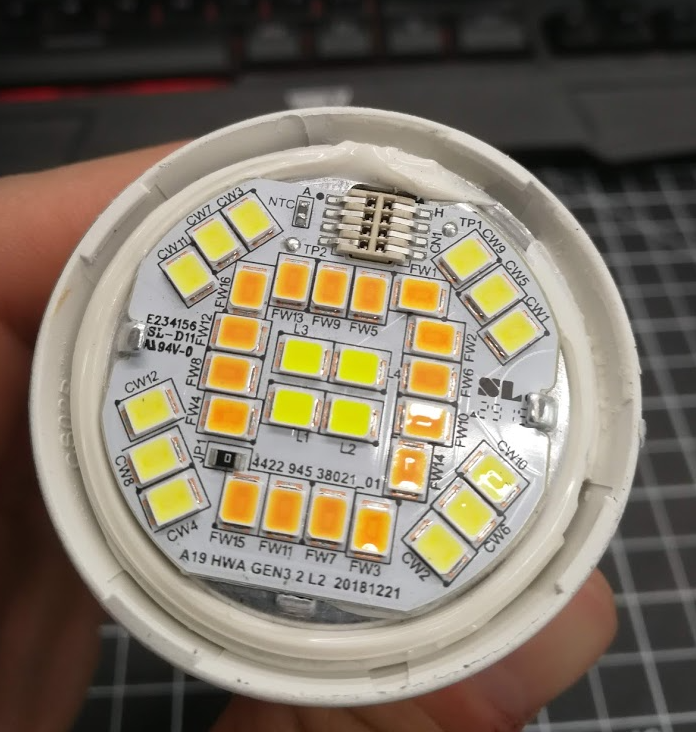
The daylight LEDs, labeled “CW”, and tungsten LEDs, in this case labeled “FW”, (we’ll get back to that) are fairly standard. In the centre is where it gets interesting, with the LEDs labeled “L”. This is lime green.
Here is a closeup of those LEDs plotted on an XY graph, with the black body curve, and an interpolation line between them:
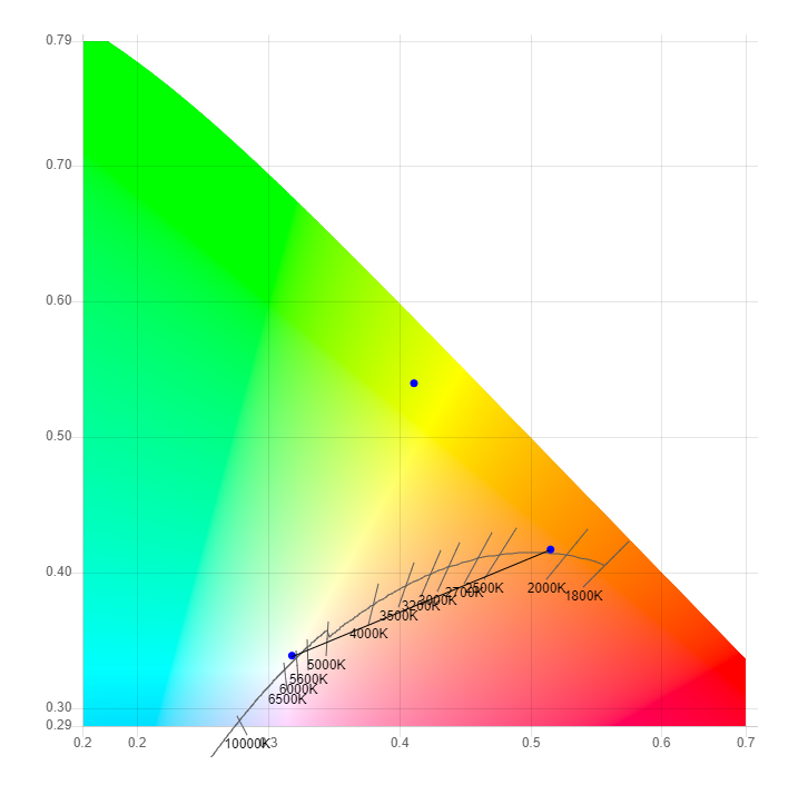
With both of the tungsten and daylight LEDs located on the black body curve, fading in between the two will drag the light significantly away from what we perceive as “white”, essentially making the light look magenta. The lime LEDs, towards the top of the graph, are perfectly situated to pull the light output back onto the curve when the bulb is at an intermediate temperature. Some further investigation into the meaning of the LED designators on the PCB, “FW”, reveals that some LED manufacturers with that particular temperature of LED call it “flame white”. It’s substantially warmer than most bicolour white LED tapes, at around 2200K. Mint LEDs are also sometimes used for the same purpose as lime LEDs. Mint has similar spectral components to lime, but with a little more blue components, moving their xy coordinates a little more towards the bottom-left.
Here they are next to a high quality warm/cool (bicolour) LED tape:
From left to right: my daylight, Philips daylight, my tungsten, and Philips flame. Daylights are fairly similar, within binning and measurement tolerances. My tungsten LED is 2600K, showing how far the Philips flame LED is into the red spectrum. Another strategy for getting temperature that warm is to add an amber LED.
Tungsten, flame, and amber, left to right respectively:

Tungsten LED can be combined with amber to get a warmer (lower) temperature. Amber has an additional purpose: Standard RGB gamuts don’t have a whole lot of range in between the red and the green colours, which can be filled out with the added amber channel. More on this in a bit.
“Gamut” is the displayable area made possible by mixing the available colours. Displayable points drawn with each primary colour, and the available gamut is any point within the area.
Here’s a typical RGB LED tape.
And their spectral distributions:
This green has a slightly wider spectrum than the other primaries, so it doesn’t fit as nicely on the edge of the xy graph. It’s made up of mostly 520 nm and 540 nm components.
The MacAdam ellipse is a graphical representation of what observers see as “one colour”. That is, anything in the ellipses shown appear to be the same colour to a regular person. This particular image is only the results from one participant in the study, so it shouldn’t be taken as definitive, but it does show trends that can provide actionable insights. The shapes are also exaggerated by about ten times for ease of clarity.
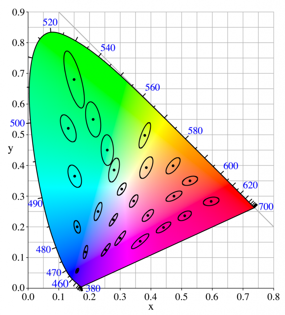
The ellipses tend to flow in the direction of the blue-red line, for example, showing only a few different perceptible shades in between those two primary colours. Red to green however, particularly in the red to yellow region, are extremely granular. This is where amber comes in.
The amber gives additional granularity in the existing gamut region where our eyes are very sensitive, and in the space where the gap between the RGB peaks is largest.
Emerald green, at 560nm, is another LED that would help fill out the spectrum gaps, providing more range towards the green part of the red-green line. Emerald and amber doesn’t alter the overall gamut significantly, however. There are areas without coverage on all sides of our gamut triangle, but the area to the left of the blue-green line is the most significant. This could be supplemented by InGaN cyan LEDs, at 505nm. That will be the topic of future experiments.
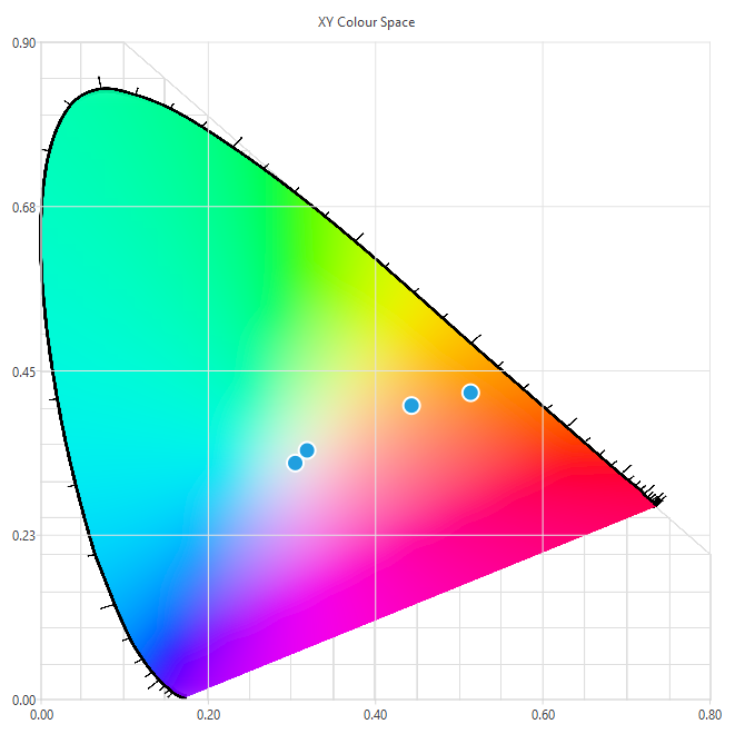
For reference, here is a graph of all of the colours measured and discussed.
